
Hi, I’m Hana.
Competition ︱ 2024
Hana Card is a leading South Korean financial services company offering credit and debit card solutions tailored to diverse customer needs. Renowned for its innovative technology, exceptional customer service, and rewarding benefits, Hana Card seamlessly integrates financial convenience with lifestyle perks, empowering individuals and businesses to thrive in a connected world. They host an annual credit card design competition for the new year, and for new customers. I participated in this competition. For this year, I had to design three different categories: debit cards for young and new customers, especially MZs, a travel card that is designed to be used abroad, and a company credit card for small business owners.
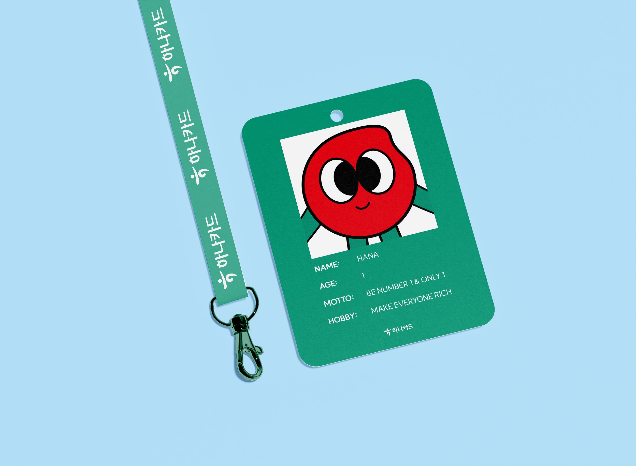
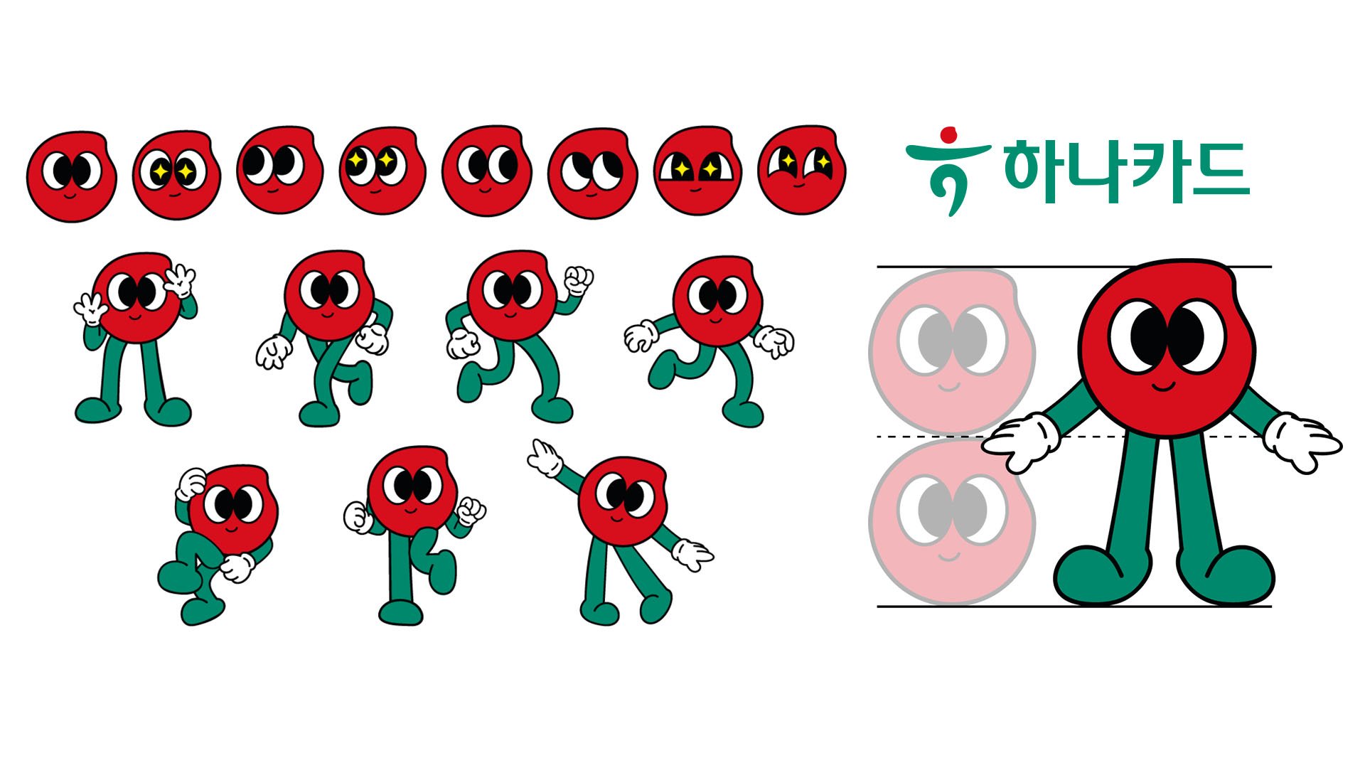
Inspired by the red part of the Hana Card logo, I designed a character named “Hana” – Hana means one in Korean, and it also means “only one, lucky one, and number one card.” I created this illustration with two main goals in mind:
To appeal to the experience that anyone can use this bank to feel special since the character represents a single individual
To create cute, friendly, and lively characters to appeal to young customers
The Hana card is known for being green, but I intentionally used the red part of the logo since the color represents good fortune and joy in Asian culture. On a global scale, many world leaders have worn red to symbolize their power. I wanted to create a bold, vibrant Hana card that customers will enjoy and have fun using.

1. A debit card for new and young customers, designed to encourage MZ and smart spending. I wanted the card to be a symbol of good fortune, portraying that luck will come if you use this card. I added illustrations of lucky charms from all over the world, using vivid colors to capture attention, as well as the ‘one’ character to make it feel more friendly and approachable.


2. A travel card that is designed to be used abroad. I wanted to illustrate a travelling card, so I added illustrations of famous global landmarks. The ‘one’ character is strategically placed between the landmarks, reminding the customer they can use the card wherever they go. I maintained a vivid color palette to create a fun mood, so that this card is also enticing for young customers who already have Hana debit cards.


3. A company credit card for businesses. I wanted to depict that businesses will flourish and expand when they use this card, so I created a staircase made from a dollar bill to symbolize a company reaching the next levels of growth. I intentionally used a US dollar to represent international expansion. With each step, the ‘one’ character feels more and more joyful.


